 |
| Insidious Poster |
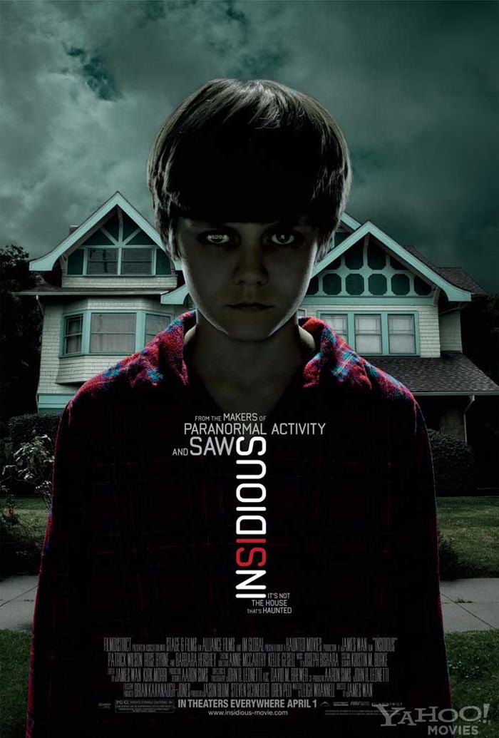
Around the title of the film it says "From the makers of Paranormal Activity and Saw" these are popular horror series which will attract a vast audience from fans of the previous films and from people who are new to horror films but know the films named.
The background shows a house with a stormy sky which could mean the house is the main setting of the film. The sky and house give an eary effect and suggest that something has or is going to happen there.
Below the title it says "It's not the house that's haunted" this makes you want to know what is haunted, automatically you would link it to the boy as he has a sinister look. This is placed in a small font which could create drama.
At the bottom of the poster there is a list of actors name in the centre it says "IN THEATERS EVERYWHERE APRIL 1" this brings attention to itself as it is in a larger font and is in bold text. Below it also lists the films website which is used to advertise the film more.
1 comment:
the word 'theaters' also denotes that this is an american ad!
Post a Comment